Tuesday, October 19, 2010

Workshop 3 - Re-presenting Representation

The space between the space...
Concepts of 'Angles' and 'Time'

Draft sketches of the space


First concepts...


Casting Shadows...


The Finished Product...
Two boxes of 20cm x 20cm, which are simiilar yet different. One is movable, the other is static. Yet they compliment each other, and both are produce unsusual angles and shadows when looking through the shapes. The geometry in each are designed to reflect the twisting and turning of time.


Shadow Drawings...


Tuesday, September 14, 2010

Workshop 2 - Drawing and Rendering

South Coast House
Fergus Scott Architects

Drafted in ink, and rendered using pastel and graphitint pencils, these plans were designed to convey a sense of warmth. The house is situated on a fairly barren headland, so i chose to use this colour scheme to contrast the surrounding landscape.


Tuesday, August 17, 2010

Arch1142 - Architectural Communications

Drawing Workshop 1

Our first exercise involved drawing a plan, section and elevation of this teacup, using freehand drawing with the aid of construction lines...


Teacup - Plan, Elevation and Section


The second exercise utilised 2-point perspective drawing, in a kind of 'complete the picture' task, to create the stairs, ramp, cylinder and house in the picture below.


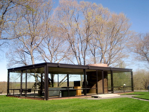
The third task was far more challenging, as we needed to imagine placing the Rose Seidler House squarely (and to an approximate scale), on the Science Lawn at UNSW. Ensuring the size was relevant to it's surroundings was fairly difficult, as was drawing the ramp at the correct angle.
Rose Seidler House, situated on Science Lawn @ UNSW


The Final Task required creating hand drawn plans, elevations and sections of the Rose Seidler House, as well as a 3D perspective drawing.

Visiting the house in person definitely helped to make sense of the original Seidler plans we were provided with, as well as getting the chance to experience the space, and how it feels to move about within such a renowned architectural work. The right angles and straight lines of the design are particularly striking, but never repetitive, and the enormous quantity of glass creates a light and spacious feel to the home.

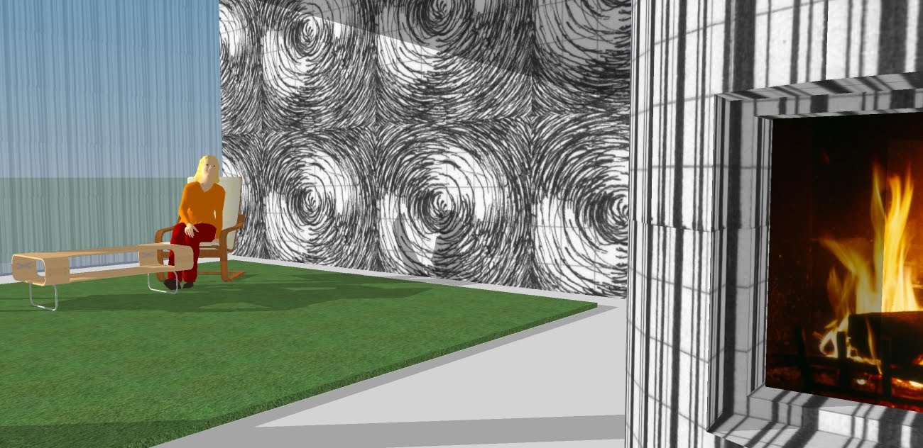
 I decided to keep my plans, sections and the overall design of the presentation drawings quite simple, using bold lines to emphasise the orthogonal geometry, keep the layout open and to give the sense of flowing but organised space.

Layout of Display (3 panels)


Left Panel


Middle Panel


Right Panel

Saturday, June 12, 2010

Review & Final Thoughts


Student Review


Final Thoughts...

The Crysis Level didn't turn out exactly as I'd planned, but overall, I think the finished product communicates what I set out to convey. Errors and "crashes" with Crysis were the main source of frustration, especially when I wasn't able to complete the vegetation and textures of the level due to a 'memory overload', and the lift was still not working perfectly in the finished product. Yet it's satisfying to be able to create a design in this environment and walk through it in order to experience the architecture first hand.

Thursday, June 10, 2010

The Final Crysis Environment

Links to Levels & Objects files on Filefront
http://www.filefront.com/16958549/3308399_levels.zip
http://www.filefront.com/16958681/3308399_objects%20%282%29.zip


Screenshots of the completed environment

 The bridge between two studios.

By designing the bridge to follow the curve of the cliff face, I wanted it to parallel it's surroundings, yet still stand apart. It's support comes from each end being cantilevered; driven into the cliff face. The material chosen was a black ribbed metal, to give it a strong and powerful appearance, with clean lines and a reflective surface.


Perspective from the dining table


 Perspective of the Kerr studio from the bridge


The Keller Studio from the Bridge


Wednesday, June 9, 2010

The Studios

Miranda Kerr's Studio

Kerr's studio is dramatic and commanding; it's outlook is open, yet it's shape wraps around the occupants. This is designed to reflect the model's power attained from her inherent beauty, exposed to the world for admiration. The studio deliberately doesn't blend with its surrounds; it is striking like the surrounding landscape, but the studio's power arises from its unusual differences and it's presence upon the cliff.


Helen Keller's Studio


Monday, June 7, 2010

Precedents


Inspiring architecture for Miranda Kerr's Studio

The Shell House
Karuizawa forest, Nagano, Japan

This design from Kotaro Ide of architecture firm Artechnic (2008), boasts the cross-section of a conch seashell, with its double-elliptical shapes and curves. Made of reinforced concrete and wood, the structure 'floats' 1400mm above the ground, and designed the structure to be deliberately mysterious: "not quite part of the landscape, yet not a ruin".


Elrod House
Palm Springs, California


The Elrod House was built in 1968 by architect John Lautner, who was apprentice to Frank Lloyd Wright in his early years. This 8901 square foot concrete house is one of Lautner's most famous private homes due to it's relationship to the surrounding mountainside (including boulders inside the living areas), and it's sense of drama. It also appeared in the James Bond film "Diamonds are Forever".


Cloud Gate
Millenium Park, Chicago


Cloud Gate by artist Anish Kapoor is a 110-ton elliptical sculpture,of a seamless series of highly polished stainless steel plates, reflecting the city skyline. Inspired by liquid mercury, the sculpture measures 66-feet long by 33-feet high. A 12-foot-high arch provides a "gate" to the concave chamber beneath the sculpture, inviting visitors to touch its mirror-like surface and see their image reflected back from a variety of perspectives.

Source: http://www.millenniumpark.org/artandarchitecture/cloud_gate.html


Inspiring Architecture for Helen Keller's Studio

Farnsworth House
Plano, Illinois


Ludiwig Mies van der Rohe designed Farnsworth House in 1951. The architecture of the house represents the ultimate refinement of the architect's minimalist expression of structure and space. It is composed of three strong, horizontal steel forms - the terrace, the floor of the house, and the roof - attached to steel flange columns. In contrast to it's natural surroundings, it appears almost temple like: "The calm stillness of the man-made object contrasts also with the subtle movements, sounds, and rhythms of water, sky and vegetation."


The Glass House
New Canaan, Connecticut


Similar to the Farnsworth house, The Glass House built in 1949 by Phillip Johnson, consists of quarter inch thick glass panels, supported by a black steel frame. More of a viewing platform than a practical home, it, consists of an open plan, symmetry and colours of the surrounding landscape.

36 Custom Textures