Friday, March 16, 2012
Monday, March 28, 2011
The Drawings
The drawings took a long time to complete, simply because of the size and amount of detail in the house. I was fairly happy with the result but think that the use of heavier / lighter lineweights would have given a greater contrast. I would probably choose to hand draw them if I could do it again, simply because I think more expression could be added with ink, as opposed to CAD.
In my analysis, I've tried to show three things: public space (bold lines), private spaces (fine lines) and corridors / circulation routes (grey hatch). The lift is shaded black. These were designed to emphasise the following points:
- Each space is connected to others, providing multiple options by which to circulate
- Corridors and stairs are located mostly toward the interior of the building, and usually travel pass the public areas to reach the private areas.
- The upper level (or bedroom level) is exclusively private space
- The cubic nature of all of the rooms
The analysis on the second poster shows the cubic layout from a sectional view. Rooms are highlighted with a heavier line, whilst corridors in between are lighter. Here we can see the level changes, room heights and the contrast between these and the slope of the site. When each level is layered on top of the other, it demonstrates how the general height and level of rooms decrease from the outside toward the inside, almost as though the space closes in as you draw closer to the centre of the villa.
Sunday, March 27, 2011
First impressions
 |
| Basic sketches of initial impression of the Villa |
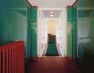
The following photos, and many others, were vital in understanding the layout of the villa and interpreting the plans. They also hint at the complexity of the spaces within the house, and demonstrate Loos' concept of 'Raumplan' by creating areas that flow into one another, rather than 'boxed in' rooms.
Loos associated decorative facades of the time with femininity, and aimed to create a masculine impression in creating the smooth white appearance and simple cubic shapes of the Villa Muller.
 |
| 1. South Facade |
Interestingly, the most exclusively feminine room within the house, the Boudoir, is placed in the 'heart' of the home, from a sectional perspective.
 |
| 2. Boudoir |
Loos, himself was considered an introspective character; a man of many ideas yet he had few close associates. Hence it is interesting to see how the house takes on the same quality in a metaphorical sense: simple facades but rich internal cladding; small windows allowing more daylight in than view out; the internal spaces protected from the villa's exposed public position; and a hierarchy of complex internal spaces contrast with simple lines of the external structure
 |
| 3. Level changes in hallway adjacent to Dining Room |
An element of voyeurism can also be read in the boundary of each space; boundary walls contain voids which allow 'sneek peeks' of other internal rooms, almost as though one could sit and observe people in another room, without being noticed.
 |
| 4. Internal view from Main Hall |
Image references:
Sunday, March 20, 2011
Project One - Villa Muller
Villa Muller:
A background to Loos' ideas...
Adolf Loos certainly knew what he did not like.
Adolf Loos referred to Vienna as ‘The Potemkin City’; a place where culture and identity was hidden beneath a mask of decorative facades. He argued that the newly built Ringstrasse, a boulevarde lined with elaborate buildings, did not represent his home city in its entirety. It was merely designed to ‘show off’ Vienna’s wealth and sophistication.
Loos also rejected the Vienna Secession, a movement to steer art and architecture away from conservative historicism. Its philosophy proclaimed “To every age it’s art and to art it’s freedom” but for Loos, this movement only resulted in mimicry and wasteful adornment. He went so far as to describe ornament as ”immoral” and “degenerate” when he expanded his criticism in the 1908 essay ‘ornament and crime’.
So, Loos sought set out to demonstrate exactly what he thought was an appropriate style, through his architecture.
It is just this spatial interaction and spatial austerity that thus far I have best been able to realize in Dr Müller's house.” (stenograph of a conversation between K. Lhota and A. L., Plzeň, 1930)
A background to Loos' ideas...
 |
| Adolf Loos (10 Dec 1870 – 23 Aug 1933) |
Adolf Loos certainly knew what he did not like.
Adolf Loos referred to Vienna as ‘The Potemkin City’; a place where culture and identity was hidden beneath a mask of decorative facades. He argued that the newly built Ringstrasse, a boulevarde lined with elaborate buildings, did not represent his home city in its entirety. It was merely designed to ‘show off’ Vienna’s wealth and sophistication.
Loos also rejected the Vienna Secession, a movement to steer art and architecture away from conservative historicism. Its philosophy proclaimed “To every age it’s art and to art it’s freedom” but for Loos, this movement only resulted in mimicry and wasteful adornment. He went so far as to describe ornament as ”immoral” and “degenerate” when he expanded his criticism in the 1908 essay ‘ornament and crime’.
So, Loos sought set out to demonstrate exactly what he thought was an appropriate style, through his architecture.
 |
| North Facade |
But beyond correcting ornament and facades, Loos had more complex vision of a “plan in three dimensions”. A “Raumplan”, or plan of volumes. As he famously states...
“My architecture is not conceived in plans, but in spaces (cubes). I do not design floor plans, facades, sections. I design spaces. For me, there is no ground floor, first floor etc... For me, there are only contiguous, continual spaces, rooms, anterooms, terraces etc. Stories merge and spaces relate to each other. Every space requires a different height: the dining room is surely higher than the pantry – thus the ceilings are set at different levels. To join these spaces in such a way that the rise and fall are not only unobservable but also practical, in this I see what is for others the great secret, although it is for me a great matter of course...
It is just this spatial interaction and spatial austerity that thus far I have best been able to realize in Dr Müller's house.” (stenograph of a conversation between K. Lhota and A. L., Plzeň, 1930)
Image references:
1. http://www ribajournal.com
Loos quote reference:
Tuesday, October 19, 2010
Workshop 3 - Re-presenting Representation
The space between the space...
Concepts of 'Angles' and 'Time'
The Finished Product...
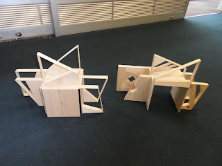
Two boxes of 20cm x 20cm, which are simiilar yet different. One is movable, the other is static. Yet they compliment each other, and both are produce unsusual angles and shadows when looking through the shapes. The geometry in each are designed to reflect the twisting and turning of time.
Concepts of 'Angles' and 'Time'
 |
| Draft sketches of the space |
 |
| First concepts... |
Casting Shadows...
The Finished Product...
Two boxes of 20cm x 20cm, which are simiilar yet different. One is movable, the other is static. Yet they compliment each other, and both are produce unsusual angles and shadows when looking through the shapes. The geometry in each are designed to reflect the twisting and turning of time.
Shadow Drawings...
Tuesday, September 14, 2010
Workshop 2 - Drawing and Rendering
South Coast House
Fergus Scott Architects
Drafted in ink, and rendered using pastel and graphitint pencils, these plans were designed to convey a sense of warmth. The house is situated on a fairly barren headland, so i chose to use this colour scheme to contrast the surrounding landscape.
Fergus Scott Architects
Drafted in ink, and rendered using pastel and graphitint pencils, these plans were designed to convey a sense of warmth. The house is situated on a fairly barren headland, so i chose to use this colour scheme to contrast the surrounding landscape.
Subscribe to:
Comments (Atom)


